Bitesized Website

- Title:
- Bitesized Website
- Description:
- A website for Bitesized, created in Hugo.
- Date:
- September 2024
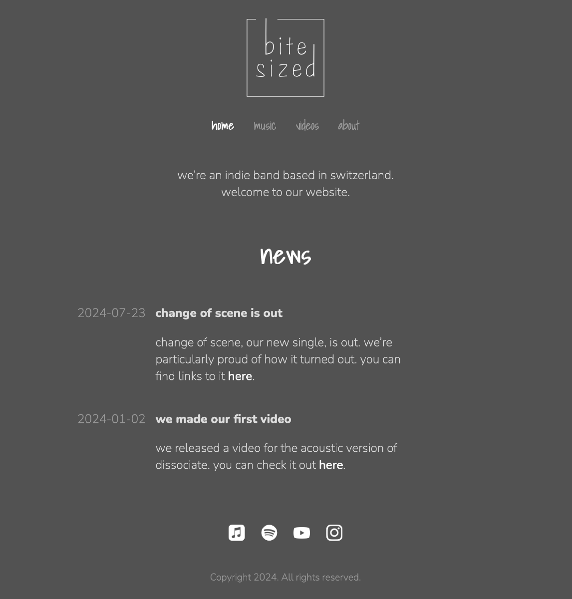
I created another website, this time for Bitesized. This one was considerably less work than the tlocrt website, as I could reuse the theme I had already built.
Since most of the Bitesized cover art is greyscale, I went with a simple greyscale look.
Bitesized is a DIY band. I tried conveying this by using a handwritten font in the headers and by incorporating custom handwritten letters in the logo.
Website features include:
- a rectangle animation when a user hovers over links
- social media icons
- a scaling animation when a user hovers over social media icons
One of my favourite parts is how the simplified logo in the favicon turned out.
